

Design Project Context Explanation:
For the electronic publishing Magazine cover design exam project, the objective was to create a captivating cover for a fictitious theme magazine while adhering to specific design requirements and guidelines. The project began with selecting a theme for the magazine and evolved into crafting a visually striking cover that effectively communicated the magazine's essence and captivated the audience's attention.
Inspiration:
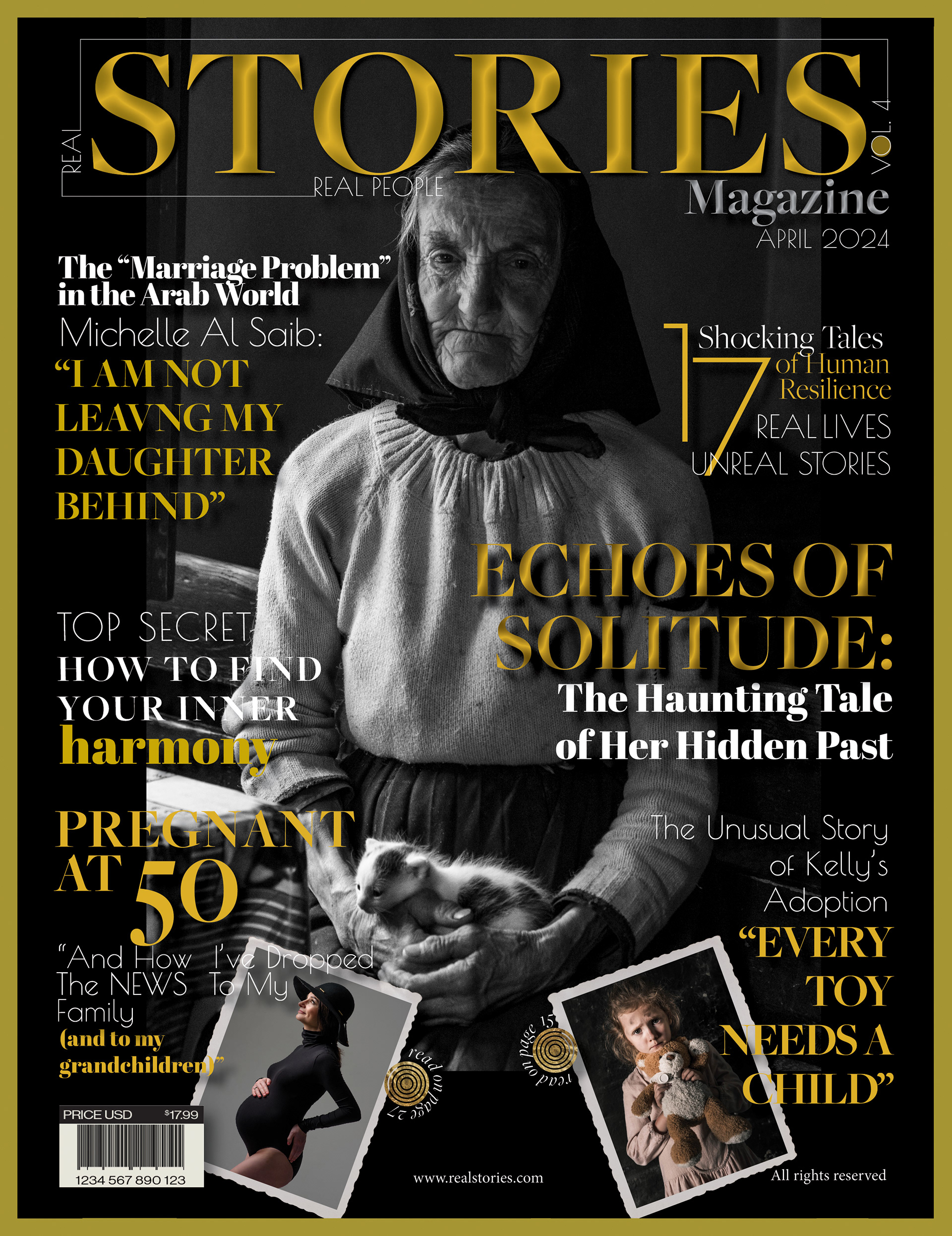
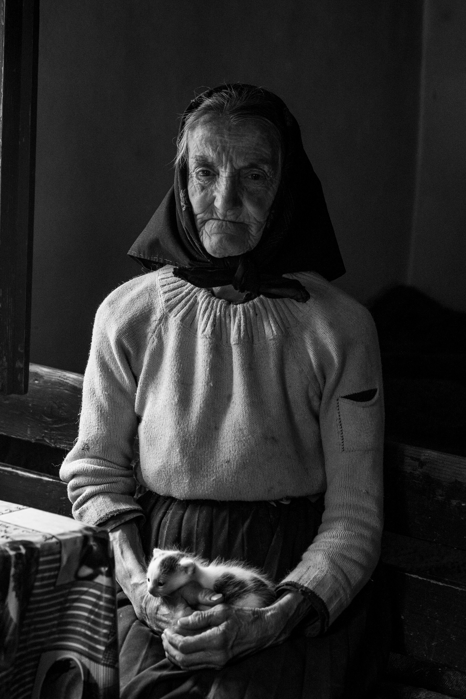
The inspiration for the magazine cover design stemmed from the theme of "Real stories, real people" and the desire to evoke drama, emotion, and intrigue. The main photograph featuring an elderly woman holding a small cat against a dramatic black backdrop served as the focal point, encapsulating the essence of solitude and mystery. The juxtaposition of the elderly woman's poignant expression with the title "ECHOES OF SOLITUDE: The Haunting Tale of Her Hidden Past" set the tone for the magazine, drawing viewers into a narrative of depth and complexity. Each title on the cover, from "The 'Marriage Problem' in the Arab World" to "EVERY TOY NEEDS A CHILD," added layers of intrigue and resonance, promising compelling stories of resilience, inner harmony, and human connection.
Color Contrast:
The strong contrast between the deep black background and the vibrant golden yellow hues was intentionally chosen to enhance the visual impact and emotional resonance of the magazine cover. The dramatic interplay between light and shadow created by the contrast accentuated the intensity of the design, drawing viewers' attention to the captivating imagery and bold typography. The golden yellow accents added warmth, energy, and a touch of luxury to the composition, while the black background exuded sophistication and mystery. This striking color contrast not only reinforced the magazine's theme of real stories but also imbued the design with a sense of drama and allure, enticing readers to explore the pages within.
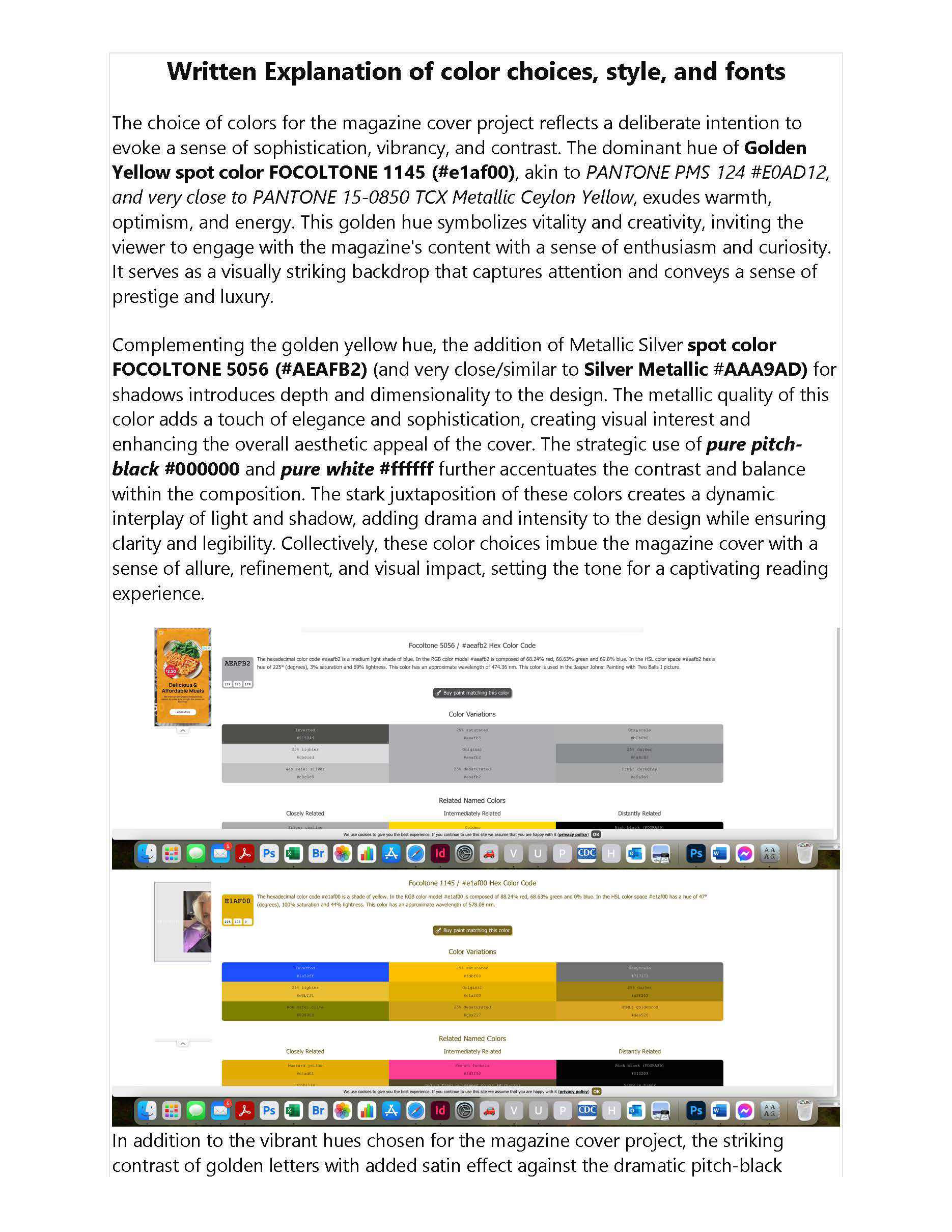
The color palette for the magazine cover design was carefully chosen to evoke sophistication, vibrancy, and contrast. The dominant hue of Golden Yellow spot color FOCOLTONE 1145 (#e1af00) symbolizes warmth, optimism, and energy, inviting the viewer to engage with the magazine's content with enthusiasm. Complemented by Metallic Silver spot color FOCOLTONE 5056 (#AEAFB2) for shadows, the design achieves depth and elegance, enhancing the overall aesthetic appeal. Pure pitch-black and white were strategically used to create contrast and drama, ensuring clarity and legibility while adding visual impact.
Style Choices:
The magazine cover design features a visually striking contrast of golden letters with a satin effect against a dramatic pitch-black background. This contrast adds intrigue and sophistication, capturing attention and elevating the magazine title and cover text. The inclusion of a dramatic main picture featuring an elderly woman adds depth and emotional resonance to the design, inviting viewers to delve deeper into the narrative within the magazine.
Typography:
The typography selection plays a crucial role in enhancing the visual impact and storytelling elements of the magazine cover design. FreightBig Pro, Poiret One, Arbil Fatface, and Minion Pro were carefully chosen for their harmonious balance of modernity, elegance, and personality. Each typeface contributes to the overall aesthetic vision, enriching the reader's visual experience and reinforcing the narrative impact of the design.
Tools Used:
Adobe InDesign served as the primary software for crafting the magazine cover design, allowing for precise layout composition and typography integration. Photoshop was utilized for photo editing to enhance the visual elements, while Illustrator was employed to create custom shapes and graphics. Together, these tools facilitated the creation of a visually captivating magazine cover that effectively communicated the theme and captivated the audience's attention.

Thank you!