


Inspiration:
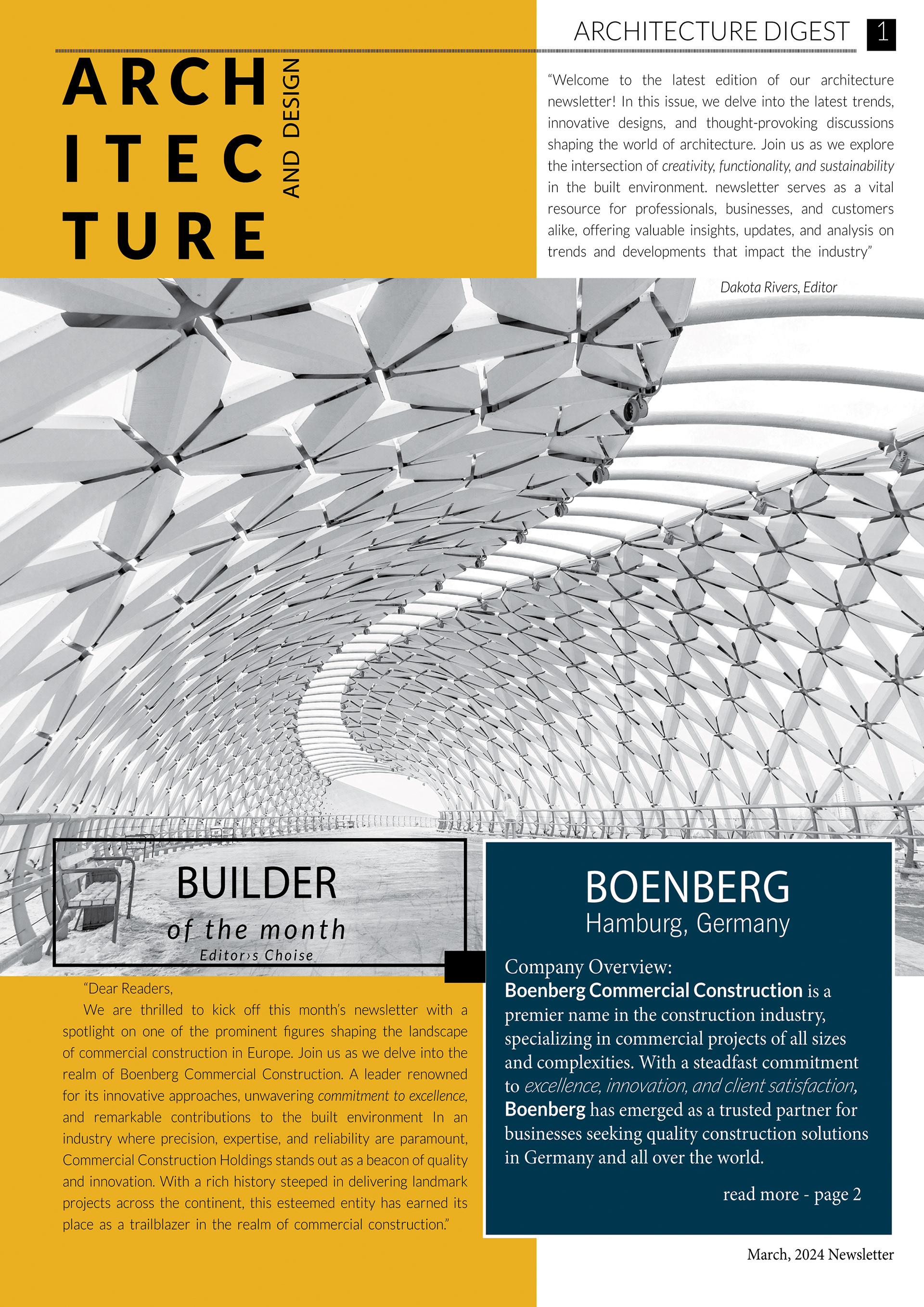
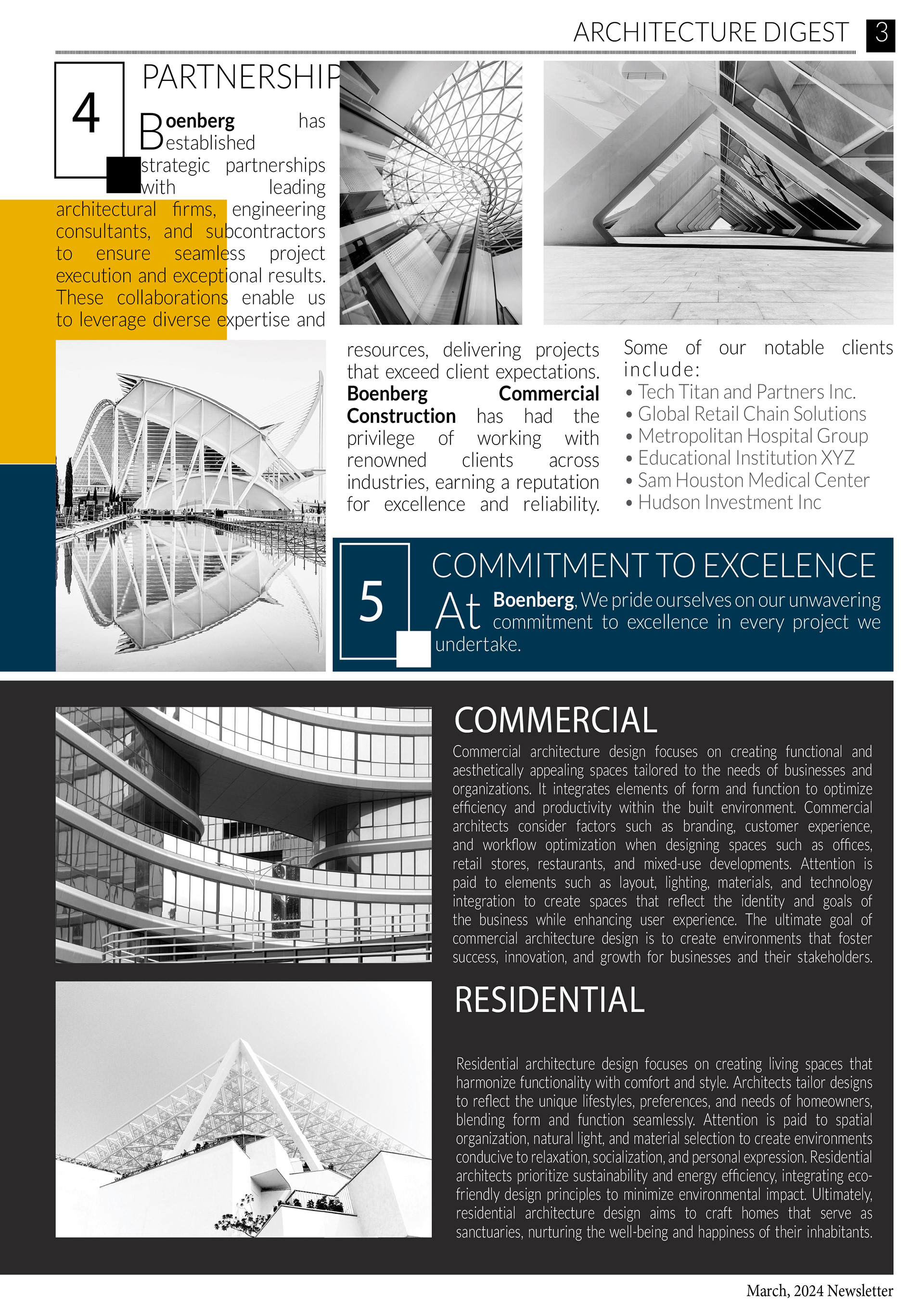
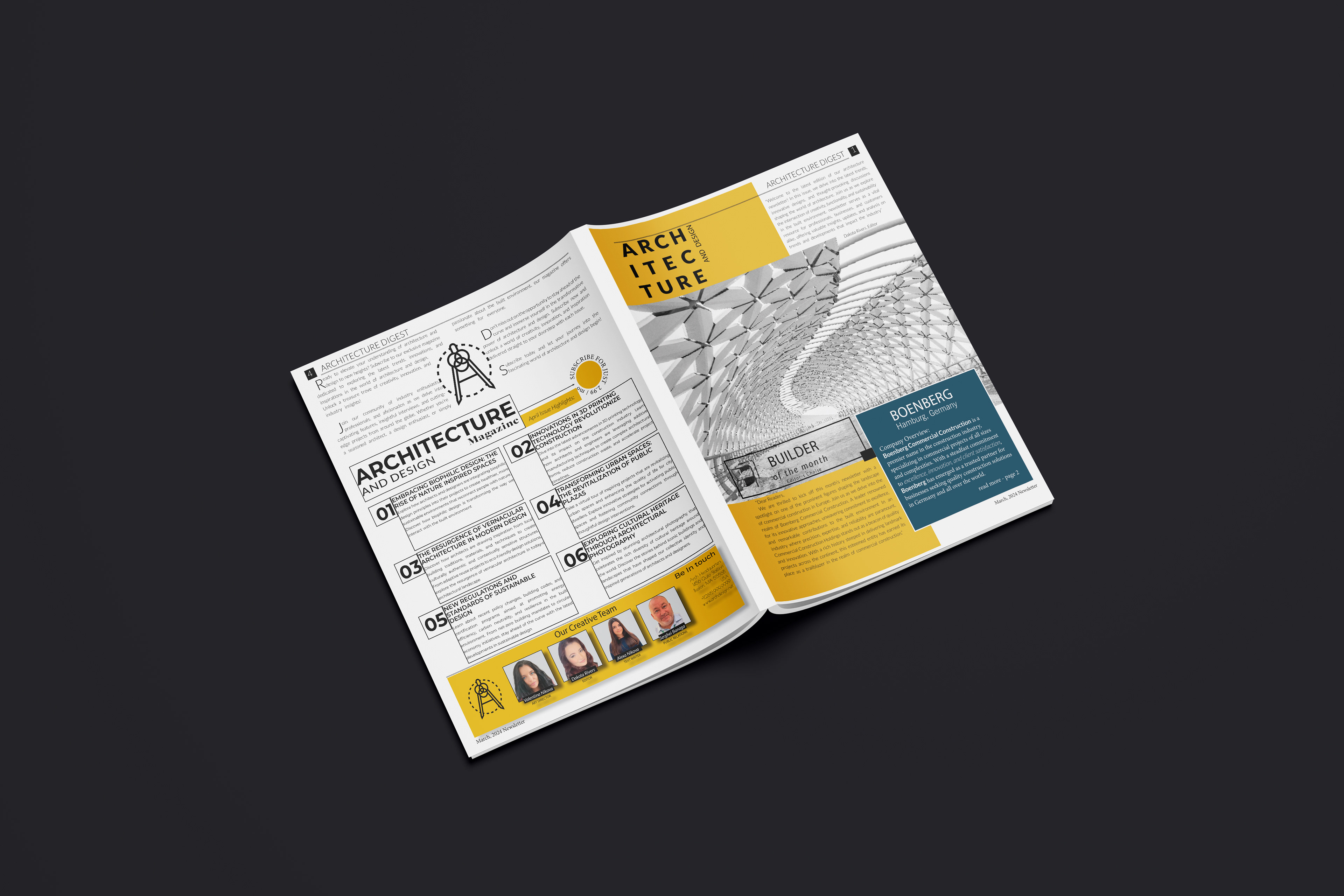
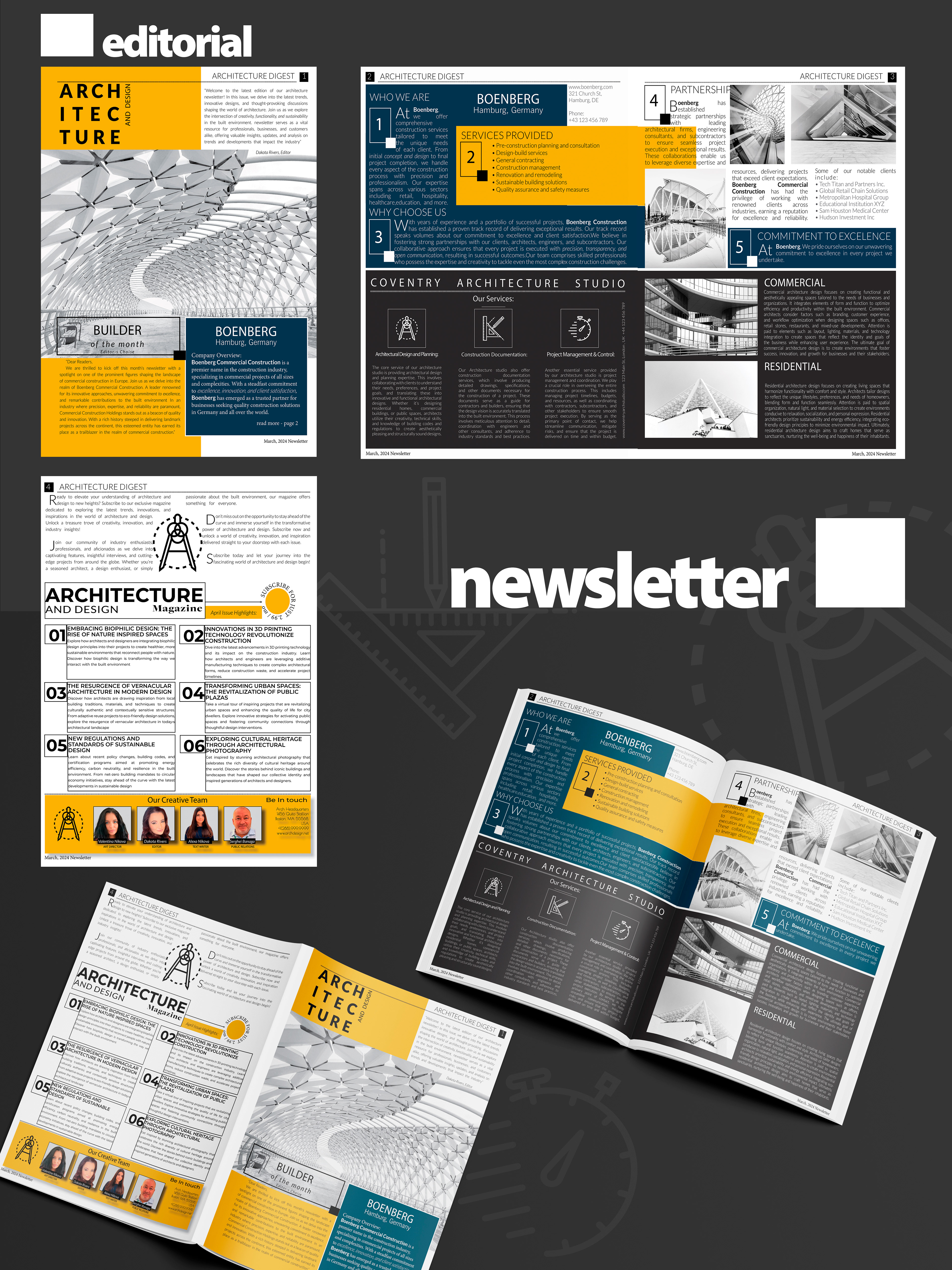
The design concept for the architectural company newsletter drew inspiration from the clean lines, modern aesthetics, and timeless elegance synonymous with architectural design. Embracing a minimalist approach, the layout featured a predominantly black and white color scheme, accentuated by grayscale images of stunning architectural landmarks and structures. The incorporation of cleverly written text, precise lines, meticulous alignment, thoughtful proximity, striking contrast, and strategic repetition contributed to a visually captivating composition that captured the essence of architectural sophistication and creativity.
Part 1of the exam project:
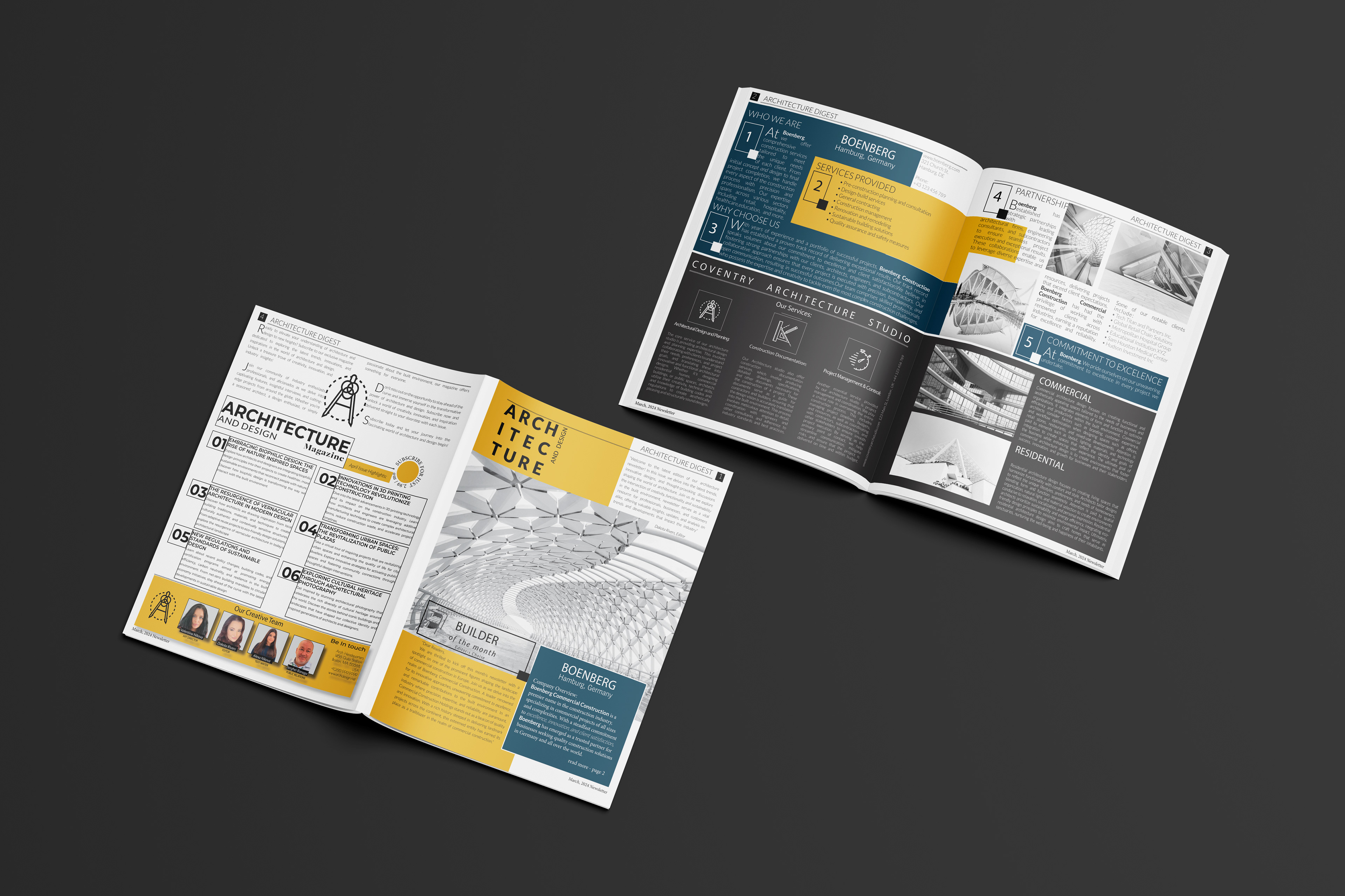
In the initial phase of the project, meticulous attention was given to adhering to the provided instructions and guidelines. Leveraging Adobe InDesign, I meticulously crafted the layout, employing techniques such as automatic page numbering, drop shadows, bulleted lists with aligned tabs, and the implementation of paragraph and character styles. The layout adhered to specified dimensions and margins, while grayscale images of iconic buildings and architectural marvels added depth and visual interest to the design. The use of clean lines, precise alignment, and strategic use of white space contributed to a cohesive and visually engaging composition that resonated with the architectural theme.
Part 2 of the exam project:
For the second part of the project, a deliberate shift in design approach was employed to introduce contrast and vibrancy. Two metallic spot colors, deep blue and soft yellow, were carefully selected from the Pantone+ Metallic Coated color book to infuse the design with energy and dynamism. These accent colors were strategically incorporated to highlight key elements and add visual interest without detracting from the overall sophistication of the layout. Preflighting the document ensured quality assurance, while viewing color separations and packaging the file for printing prepared the design for production. The final outcome showcased a harmonious blend of minimalist sophistication and vibrant contrast, resulting in a visually striking newsletter that effectively communicated the architectural company's brand identity and values.
Tools Used:
Adobe InDesign was the primary tool utilized for crafting the newsletter layout, leveraging its versatile features and precise controls to achieve a polished and professional design. Adobe Illustrator played a crucial role in creating custom graphics, illustrations, and mockups, while Adobe Photoshop was utilized for image editing, refinement, and exporting final assets. Together, these tools facilitated a seamless design process, allowing for the creation of a visually captivating newsletter that met the project requirements and exceeded expectations.
Outcome:
Upon completion of the project, the newsletter was exported as a high-quality PDF document, meticulously formatted to meet the specified guidelines and standards. The PDF showcased the layout's attention to detail, sophisticated design elements, and seamless integration of text and imagery. The clean and modern aesthetic, coupled with the strategic use of contrast accent colors, resulted in a visually impactful and professionally crafted newsletter that effectively conveyed the architectural company's brand identity and message to its audience.
Thank you